The title of a scrapbook layout does something that no photograph or journaling block can. It names the moment. It anchors the story. It tells whoever is looking at this page — now, or fifty years from now — exactly what this was. A strong title, handled well, transforms a collection of photographs into a complete memory.
Getting lettering right is one of the skills that separates finished-looking scrapbook pages from ones that feel incomplete. The good news is that there are approaches for every skill level and every style, from simple alphabet stickers to die-cut chipboard letters to full hand lettering.
Alphabet stickers
Alphabet stickers are the most accessible title method in scrapbooking. Every major manufacturer produces them in dozens of styles — from plain sans-serif to ornate script, from bold chipboard to delicate vellum. They require no special skill, adhere directly to your page, and are available at every craft shop.
The challenge with alphabet stickers is alignment and spacing. Letters that curve up or sit at different heights disrupt the visual cohesion of a title. A few practical approaches help:
- Use a pencil line as a baseline guide, erasing it after stickers are placed.
- Lay out the entire word before committing to placement — set all the letters on the page without sticking, adjust spacing, then peel and press one at a time.
- Deliberate slight variation in height (a more organic, playful style) works if it is consistent throughout the word. Accidental variation looks like a mistake.
Die-cut and chipboard letters
Die-cut letters — cut from cardstock using a die cutting machine or pre-cut by manufacturers — offer more visual weight than stickers and can be layered, painted, inked, and distressed for custom effects. Chipboard letters are thicker still, with a dimensional quality that adds real depth to a layout.
These letters are ideal for large, statement titles where the lettering is as much an embellishment as a label. They can be heat embossed, covered with Distress Ink, sprayed with mist, or left plain. A chipboard letter cluster at the top of a page, slightly offset and perhaps with ink on the edges, creates a focal point as strong as any photograph.
Stamped titles
Alphabet stamp sets produce consistent, clean lettering across any surface. Smaller sets are suited to journaling tags and small accents. Larger sets work for full titles. The result has a handmade quality — the slight ink variation and individual letter placement is visible — that distinguishes it from printed type.
For clean stamping, use an acrylic block and take care to align letters consistently. A ruler under the stamps while inking helps keep the baseline straight. Stamp onto the background paper or onto separate cardstock strips that are then adhered to the page.
Printed and digital titles
Using a computer and printer to produce titles and journaling gives access to an enormous range of fonts at any size. This approach suits digital-hybrid scrapbookers who like the precision of printed type alongside physical embellishments.
Print onto white or coloured cardstock, then cut to shape and adhere. Print onto acetate or vellum for a transparent title overlay. Use a word-processing programme with access to free downloadable fonts to create exactly the style you want. The limitation is that printed titles can look flat compared to physical sticker and chipboard options — combining printed type with a physical embellishment on top mitigates this.
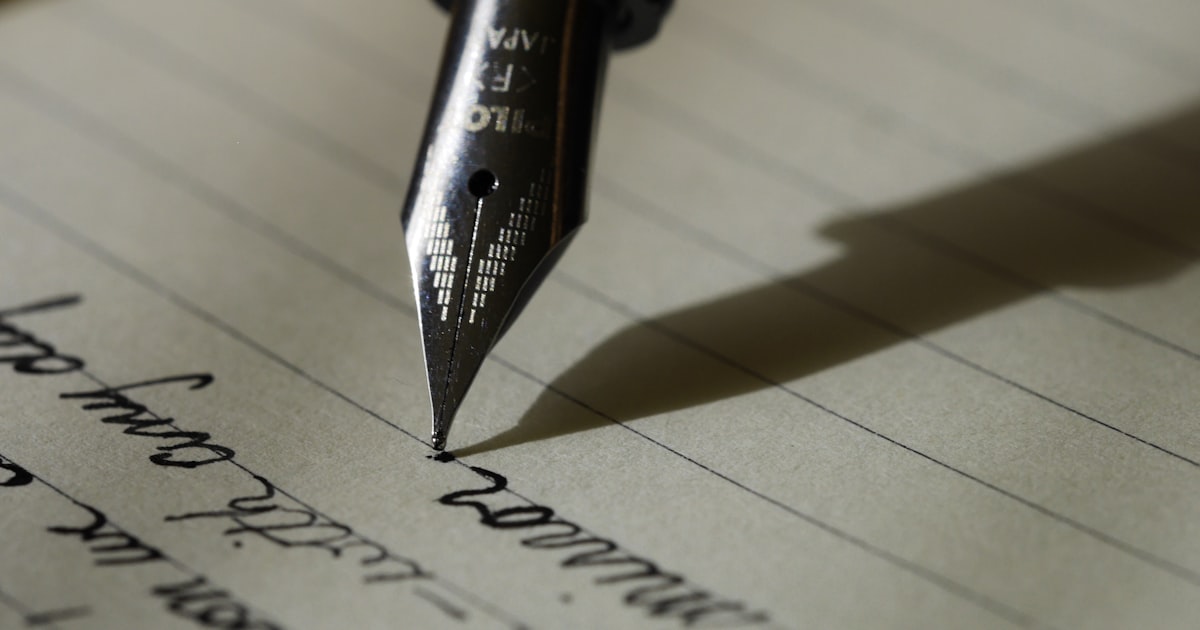
Hand lettering for scrapbooking
Hand lettering — writing titles with brush pens, calligraphy pens, or fine-tipped markers in a deliberate, stylised way — gives a uniquely personal quality to a page. No two hand-lettered titles are identical, which is exactly the point.
Getting started with hand lettering does not require natural talent. Brush lettering specifically — which uses the flex of a brush pen to create thick downstrokes and thin upstrokes — is a learnable skill. The basics can be practised on layout paper in an hour. The key principles:
- Pressure determines stroke weight: Press down on downstrokes, lift pressure on upstrokes. The variation between thick and thin is what makes brush lettering look like lettering rather than writing.
- Go slowly: Hand lettering is not fast handwriting. Each stroke is deliberate. Slowing down dramatically improves results.
- Practice on layout paper first: Lettering directly onto a finished page before practising produces anxiety. Practice separately, cut out, and adhere once you have a version you are satisfied with.
Choosing a title approach for your layout
The right title method depends on the style of the page. Clean, minimal layouts suit thin die-cut letters or simple printed type. Vintage and heritage layouts suit stamped or distressed chipboard lettering. Playful, bright pages suit chunky alphabet stickers. Mixed media pages suit hand lettering or rough, inked chipboard. The title should feel as though it belongs to the same visual world as the rest of the layout.
"The title is the first thing most people read on a scrapbook page. It is worth giving it the same care you give the photographs."
Title placement on the page
Titles most commonly appear at the top of a layout — this is the natural reading position and creates a clear entry point. But titles at the bottom ground the page and work well for large single-photo layouts. Vertical titles along the left edge are less common but add interest to simple designs. Mixed placement — a large word at the top and a smaller subtitle within the journaling block — creates rhythm across the page.